


The 10 Best Blogs: 2025 Web Design Ranking

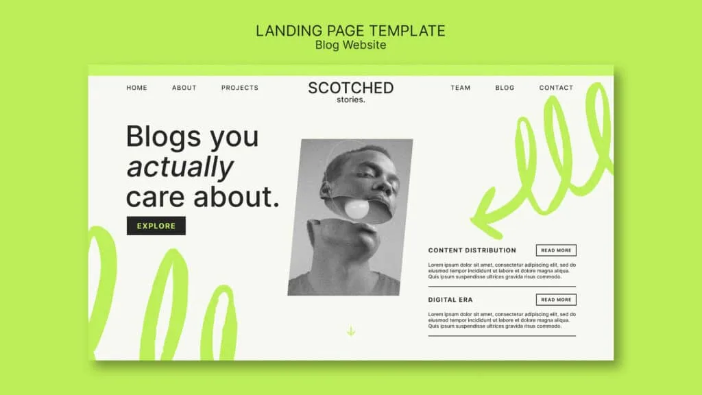
The best blogs combine aesthetics and functionality: they keep the reader engaged and make navigation simple and intuitive. In this post, we share 10 examples of blog designs that stand out this year. From minimalist styles to more elaborate options, these ideas will not only inspire you but also teach you how to improve the user experience (UX) and increase engagement.
What makes a blog design excellent?
Good design is not just about aesthetics. The key lies in creating an experience. It helps readers find content easily, enjoy navigation, and return for more.
- Clear and frictionless navigation
- Responsive design (adapted to any device)
- Easy-to-digest content thanks to well-chosen typography, good contrast, and proper spacing
- Visually appealing (high-quality images and well-thought-out color palettes)
- Fast loading times without distractions
- Visible and effective calls to action (subscription, sharing, commenting)

Common trends in the best blogs of 2025
- Minimalism that eliminates visual noise
- Focus on technical SEO and speed
- Scannable content structure (bullets, subheadings, TOC)
- Large and bold typography
- Visuals that complement (rather than overwhelm)
- Dark mode available
- Interactive elements that enhance the experience
The Top 10 Best Blog Designs of This Year
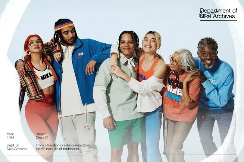
Riverside.fm – Clean design with a floating table of contents for long articles.
Jules Acree – Warm minimalism and Instagram-style visual flair.
KonMari – Aesthetics aligned with Marie Kondo's philosophy of order.
Nike Stories – Impactful visuals with brand storytelling.
Ramp – Clarity, functionality, and intuitive navigation.
Pinterest – Visual inspiration with an airy and well-organized design.
Notion – Total simplicity: black and white with a sticky menu.
SavvyCal – Side table of contents and a total focus on readability.
Unsplash – Immersive gallery where images tell the story.
HelpScout – Enriched content with podcasts and related links
💡 Tip: Evaluate your blog from the perspective of a new visitor. Do they understand what your site is about in 5 seconds? If not, it is time to optimize.
How to turn your blog into a sales tool
Good blog design is not just an aesthetic matter: it is digital architecture at the service of your goals.
Every decision—from the menu structure to typography contrast, including loading speed and interactive elements—directly impacts user retention, SEO positioning, and conversion.
Categories
News


