Services
- Branding
- Brand strategy
- Logo creation
- Graphic applications
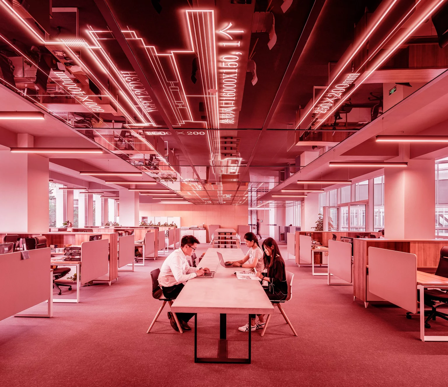
Brand creation corporate firm
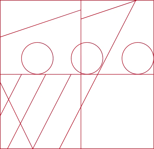
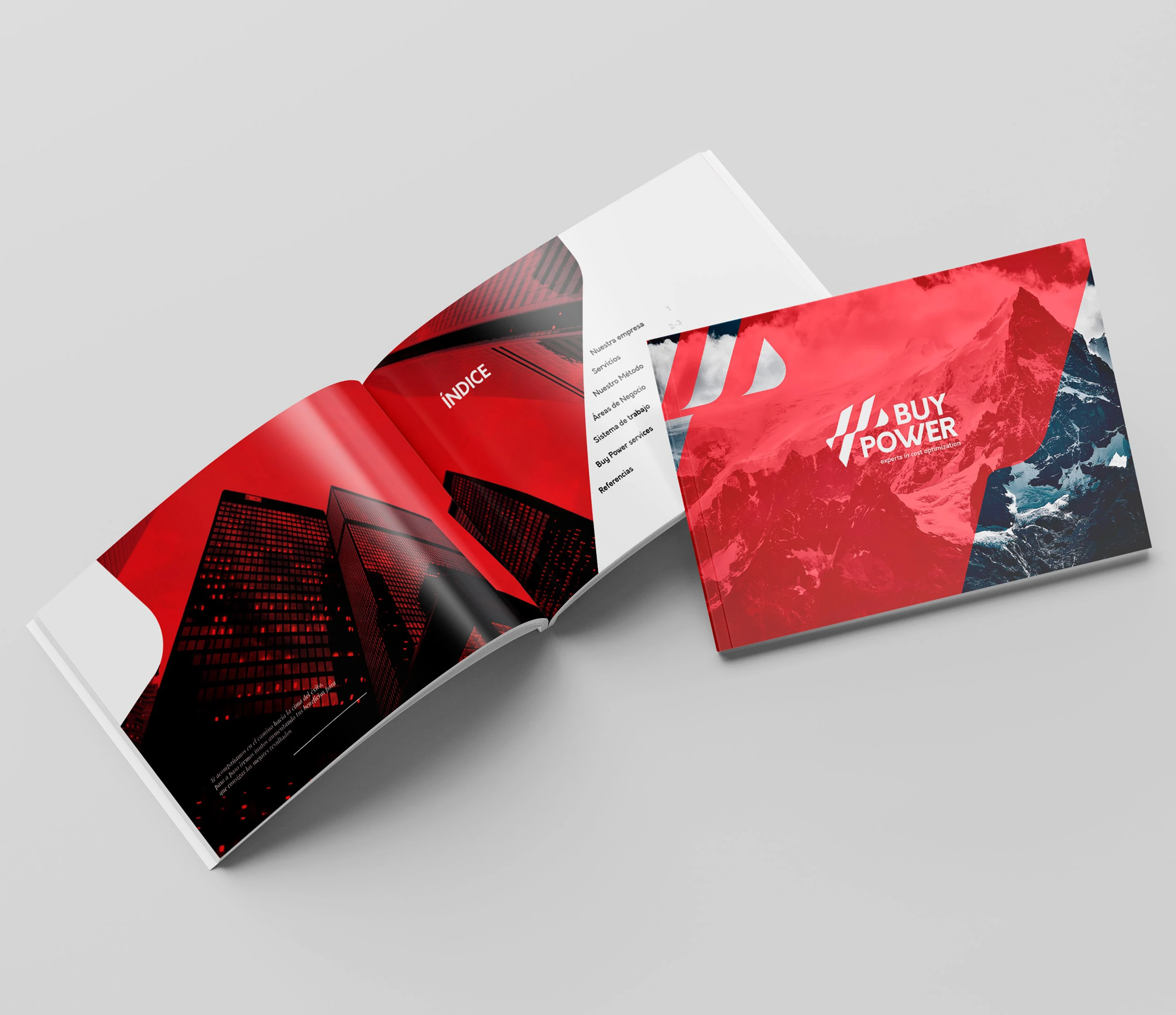
For this graphic work, we did a complete restyling of the brand, starting with a brief where we clarified all Buypower’s objectives, both conceptual and professional. We apply all these bases to the creation of the logo, where we also represent the values of the company, accompanying the client towards its goal of increasing profits. That is why the shape of the isotype is reminiscent of a mountain, which the client and Buypower climb together and, at the top, place their flag as a symbol of having achieved their goal. It is for that reason that this mountain is divided into several parts, reminiscent of a waving flag.

Flag

Mountain

Profits

Final Logo
- Before
- After

Orkney
OPEN SANS AND ORKNEY
For the project, we used Orkney as the main typeface for the representation of the logo and headlines throughout the development of the brand, a sans serif typeface created by designer Samuel Oakes. Known for its geometric style and elegant simplicity, it is perfect for this minimalist and modern design. Its legibility made it the ideal font for this branding and editorial design project. As a complementary typeface, we use the famous open sans, which is simple, legible and provides peace of mind and makes it easy to read.
Bold
ABCDEFGHIJKLMN
OPQRSTUVWXYZ
1234567890
abcdefghijklmnopqr
stuvwxyz
Regular
ABCDEFGHIJKLMNO
PQRSTUVWXYZ
1234567890
abcdefghijklmnopqrstu
vwxyz
Orkney
Bold
ABCDEFGHIJKLMN
OPQRSTUVWXYZ
1234567890
abcdefghijklmnopqr
stuvwxyz
Let's start a new project
We help you to achieve your goals, fill out this form and
get in touch with us to start a new journey


