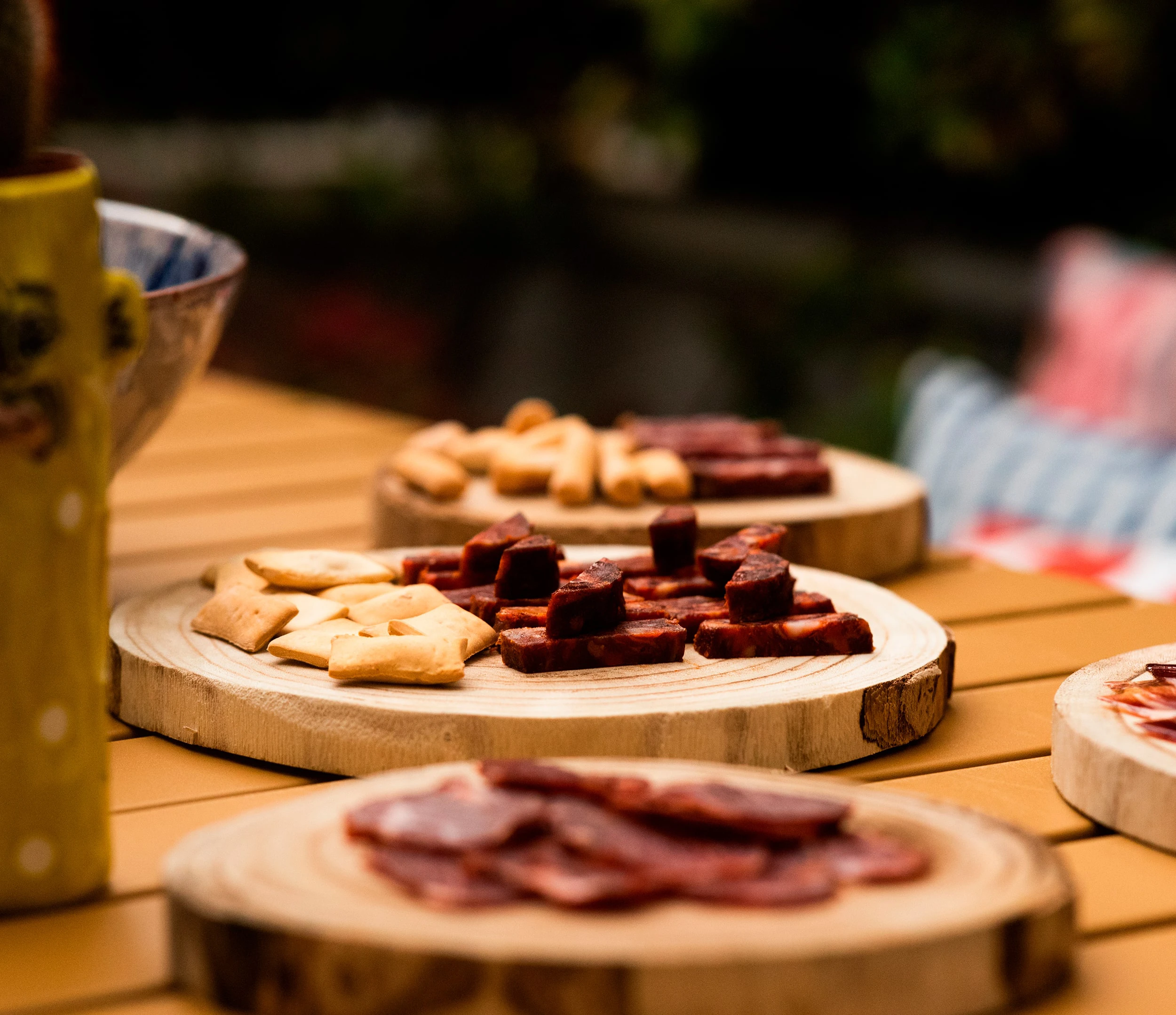
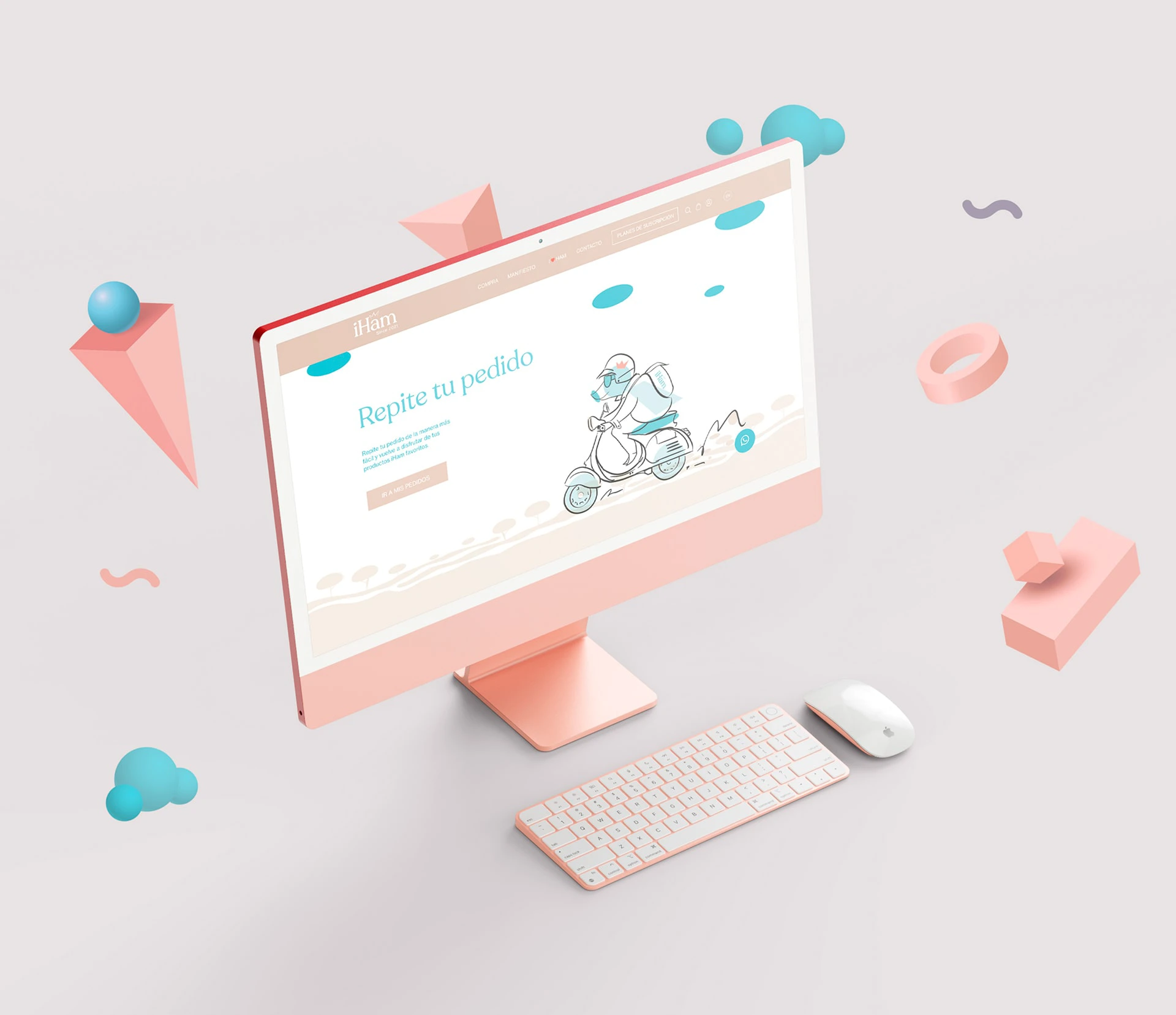
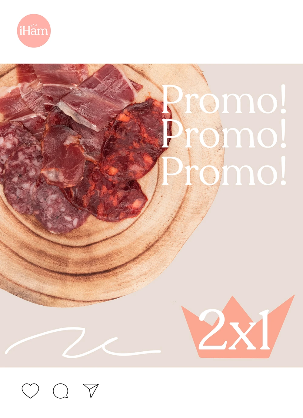
Complete development for the Iham project, including branding, graphic applications, packaging, custom illustrations and website.
Brand strategy
Logo creation
Graphic applications
Packaging design
From Several, we elaborated the creation of a brand for a different and innovative concept, within the world of Iberian ham, giving a twist to this classic food aimed at a more select public and bringing it closer to the common user who has to discover the good quality of a great product. That is why from Several, we created a unique typography for the logo based on recoleta, giving it a friendlier character but without leaving behind the premium characteristic of the king product in Spain.
Base typeface: Recoleta
Typographic customization
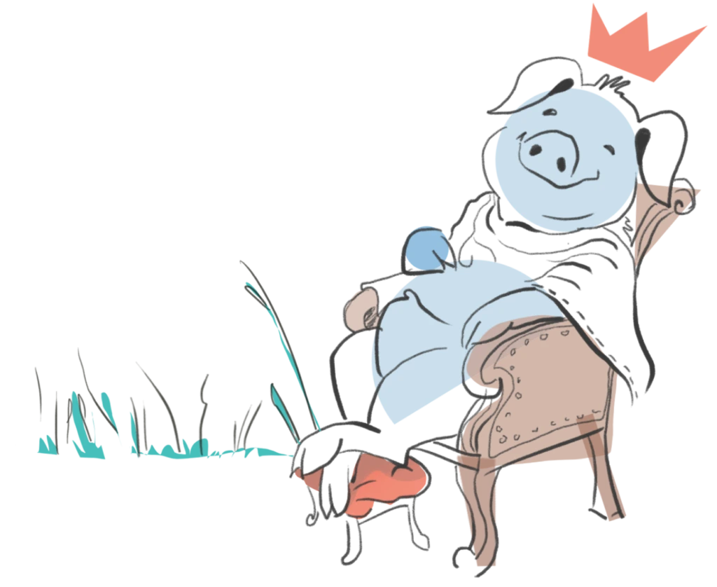
King of the pasture icon
Final Logo
BROWN
It is the main color of IHam, which refers to ecology
and recycling, natural and close.
Pantone solid coated 482C.
#E0CCBD
SALMON
Used as small touches or details
Pantone solid coated 169C
#F3B0A9
BLUE
Used for secondary elements, descriptive texts and especially
for the background of illustrations.
Pantone solid coated 631C
#71BCCD
DARK GRAY
Some details or texts
Pantone solid coated 447C
#3a3c39
HELVETICA AND RECOLETA
We used a typography such as recoleta to represent a large part of the project, focusing on the titles and the logo. Recoleta is a modern sans-serif typeface designed by Jorge Cisterna in 2018. It is inspired by neoclassical architecture and Swiss graphic design of the 1950s and 1960s. Characterized by its curved and elegant shapes, it is the perfect candidate to be part of this project. For the representation of the typography focusing on descriptions and secondary texts, the well-known Helvetica has been used.
ABCDEFGHIJKLMN
OPQRSTUVWXYZ
1234567890 1234567890
abcdefghijklmnopqr
stuvwxyz
ABCDEFGHIJKLMNO
PQRSTUVWXYZ
1234567890 1234567890
abcdefghijklmnopqrstu
vwxyz
ABCDEFGHIJKLMN
OPQRSTUVWXYZ
1234567890 1234567890
abcdefghijklmnopqr
stuvwxyz
UX Analysis
Web design
E-commerce development
Digital strategy
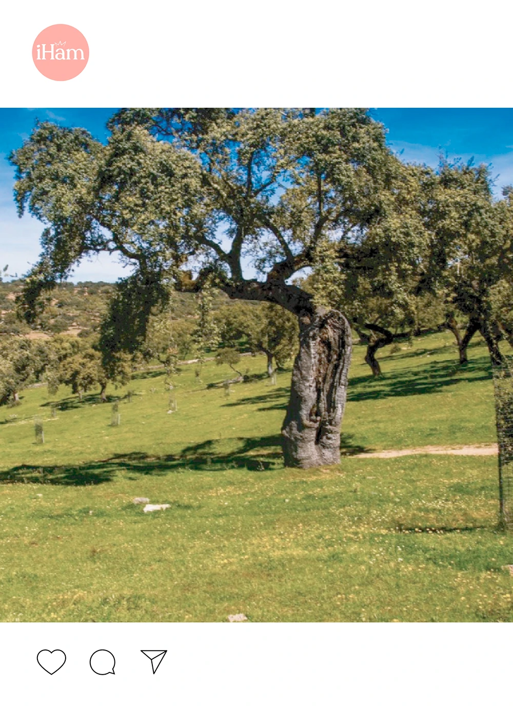
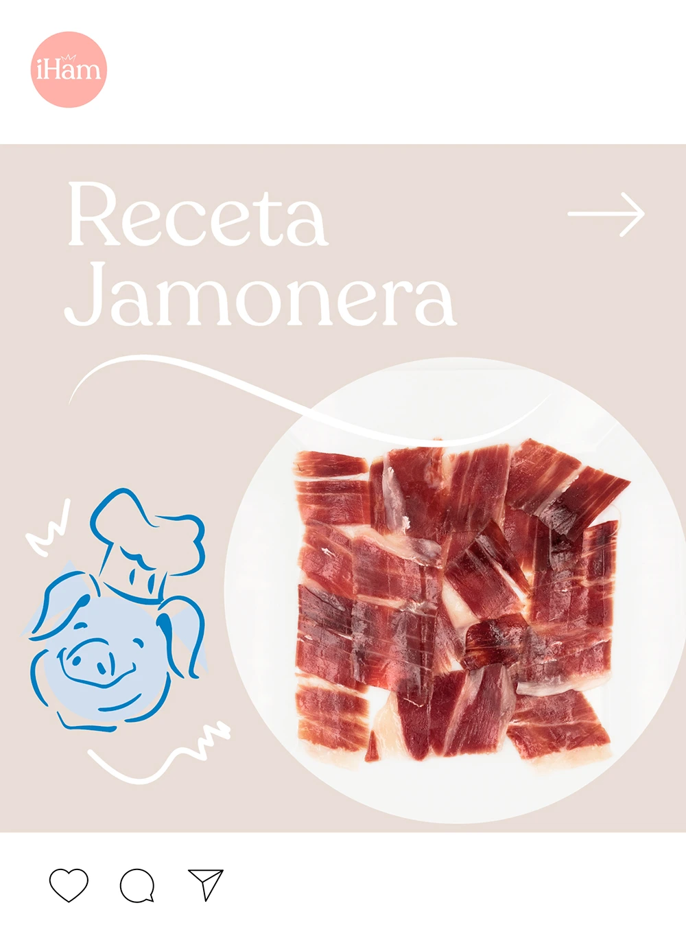
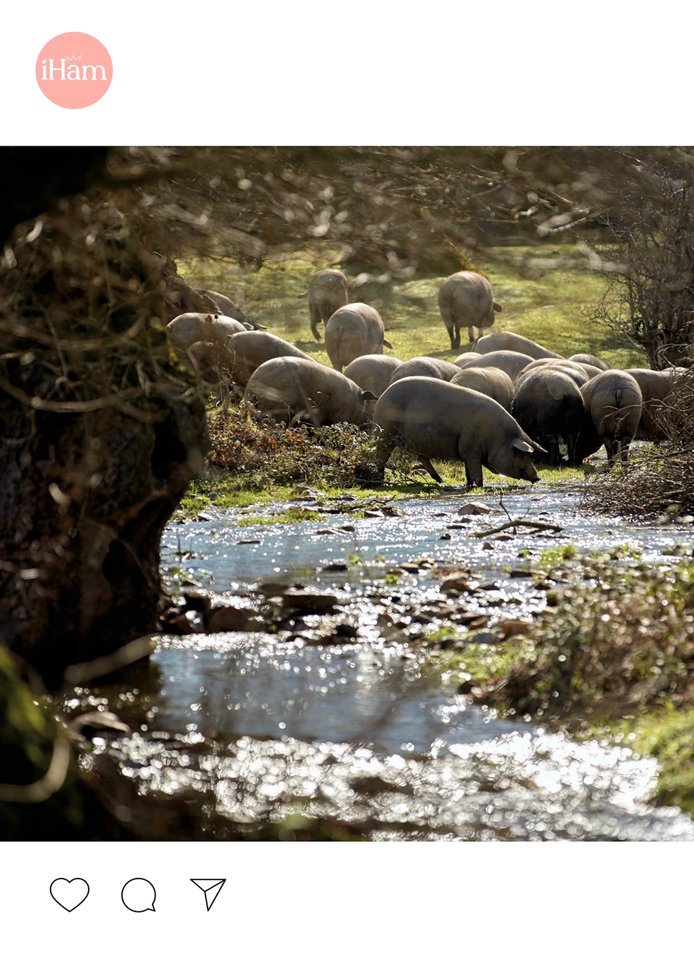
Design for social media


Packaging design
Label design
Personalized illustrations
Iham has wanted to differentiate itself from the competition since the beginning of the project, and not only has it done so through its unique product concept and shipping but also everything around it has been treated with love and care while respecting the environment. That is why Iham invested a lot of time and dedication to the choice of materials, giving priority to natural brown with illustrations and logos in white, to generate a tranquility and delicacy that strong colors could not represent.
También puedes agendar una reunión con nosotros
Agenda una reunión con nosotros
Usamos cookies para mejorar tu experiencia.