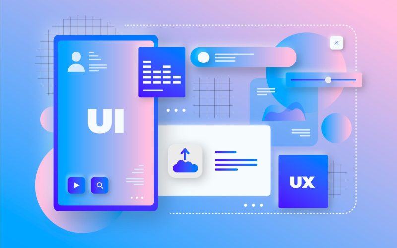
Modern web design trends in 2022 are of great interest to website developers and businesses, reflecting technical changes and growing user needs.
The evolution of design in recent decades has created a highly competitive scenario, as users spend more and more time online; the challenge lies in the experience we offer, as well as connecting emotionally with people.
As with fashion, website design often changes, but it also comes back. When developing websites, it pays to keep abreast of current and future events. Understand user tastes and what we should implement in future projects. Here are some trends:
Minimalist designs
Minimalism will probably never disappear from the list of web design trends. The content is simple, but clear, neat and clean without overloading the aesthetics. The idea is to provide a smoother browsing experience, the content is the most important thing on the website.

Microanimation in web design
The theme of minimalism reappears. Of course, micro animations have been used before, but now is the time of their popularity. This 2022 web design trend brings life to the site and its offering, and can also be an entertainment element.
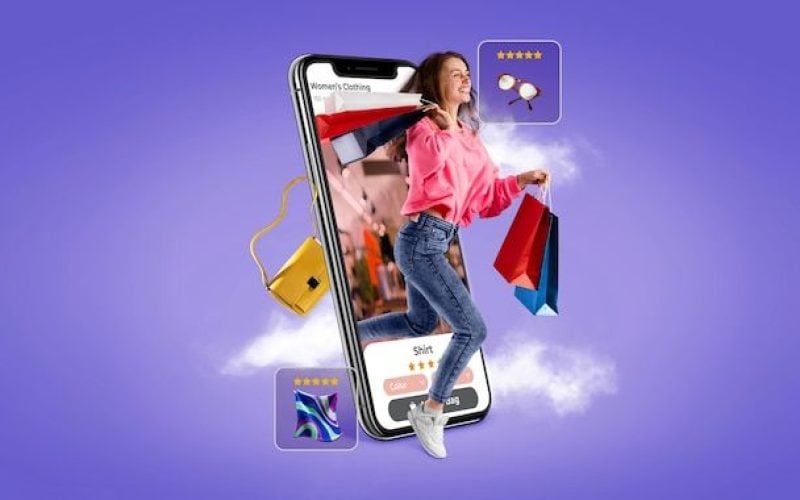
With more interactivity, we increase the level of UX. This technique works, for example, in the case of e-commerce, because the product offered becomes more attractive and tangible, which makes the purchase much easier.

Dark mode
Dark mode has taken over most social networks. Of course, this is not mandatory, but an alternative to the standard color scheme. Why did so many people choose it, rejecting bright light frames?
For some, this is a matter of aesthetic preference, and for others, it is just convenience. The dark mode is less “flashy”, so if the user spends a lot of time in front of the screen, he/she will be more comfortable.

One – page
If you have projects focused on a single idea, this is a good option to simplify everything, it is a single page website with a top menu with anchor links, where the information will be. This way it does not require the use of scrolling, this trend works to focus the users’ attention on the respective information, without causing unnecessary distractions.

Color gradients in web design
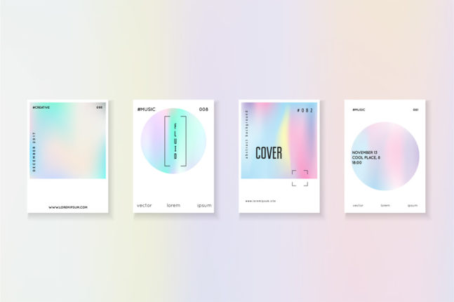
Gradients are back in fashion. Officially, they never lost their popularity, but very often the color effect was associated with only two options: iridescent or black and white. Some time ago they were used only as background.
Now they can be used as fills for selected text or to add depth and dynamism to illustrations, texture is another factor to take into account and they are usually more powerful than the background. This allows you to create a smooth transition and, thanks to the proper selection of the color palette, you get a modern look of the website.
Remember that Several.pro specializes in web design, digital marketing, social media, development and illustration. Shall we talk?

