Web Design for Latarce Winery & Restaurant
Creation of a new website and art direction for a wine cellar and restaurant located in Zamora, which wanted to make a qualitative leap to its online representation.
UX Analysis
Web design
Web development
Web design for winery and restaurant
We custom designed and programmed the website for Latarce winery and restaurant, starting from a specific brief where a radical change in the brand image was required, to give it a more premium look, with certain characteristics of history but modernity. That is why we used other types of colors, ochre, dark gray and white tones to provide the character required by the project, joining animations with shapes reminiscent of the vaults of the restaurant, which would be the window into the interior of the restaurant and cellar, where their wines, spirits and beers are located.
#0B0B0B
R: 11
G: 11
B: 11
#E8E8E9
R: 232
G: 232
B: 233
#DFCD8D
R: 223
G: 205
B: 141
#C9A34F
R: 201
G: 163
B: 79
Moret
Snell
Regular
ABCDEFGHIJKLMNO
PQRSTUVWXYZ
1234567890 1234567890
abcdefghijklmnopqrstu
vwxyz
Bold
ABCDEFGHIJKLMNO
PQRSTUVWXYZ
1234567890 1234567890
abcdefghijklmnopqrstu
vwxyz
Montserrat
For the descriptive texts of the web, we use Montserrat, a google font that allows a good readability, it is clean, minimalist and delicate. In this way, montserrat combines perfectly with the moret serif type and closes a good and refined graphic line. Montserrat is a sans-serif font inspired by the old posters of Buenos Aires, designed by Julieta Ulanovsky. Its modern and elegant look, together with its readability and versatility, make it a reliable choice for us.
Digital strategy
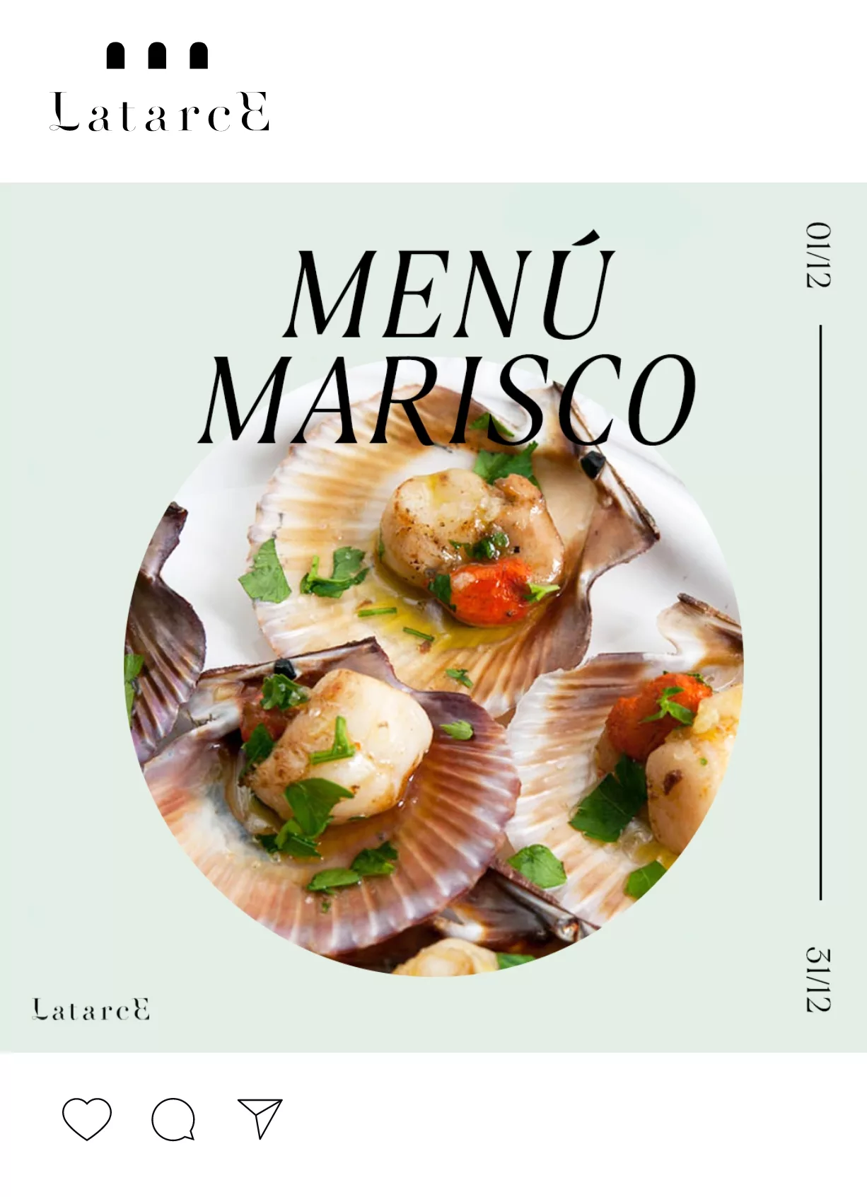
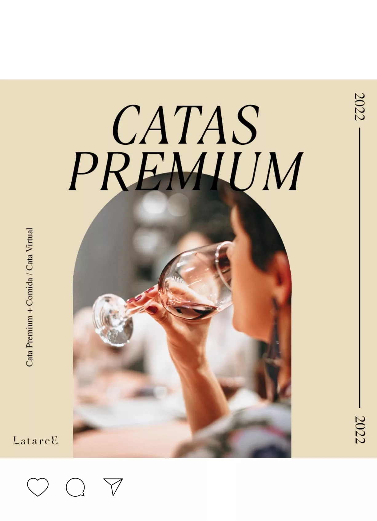
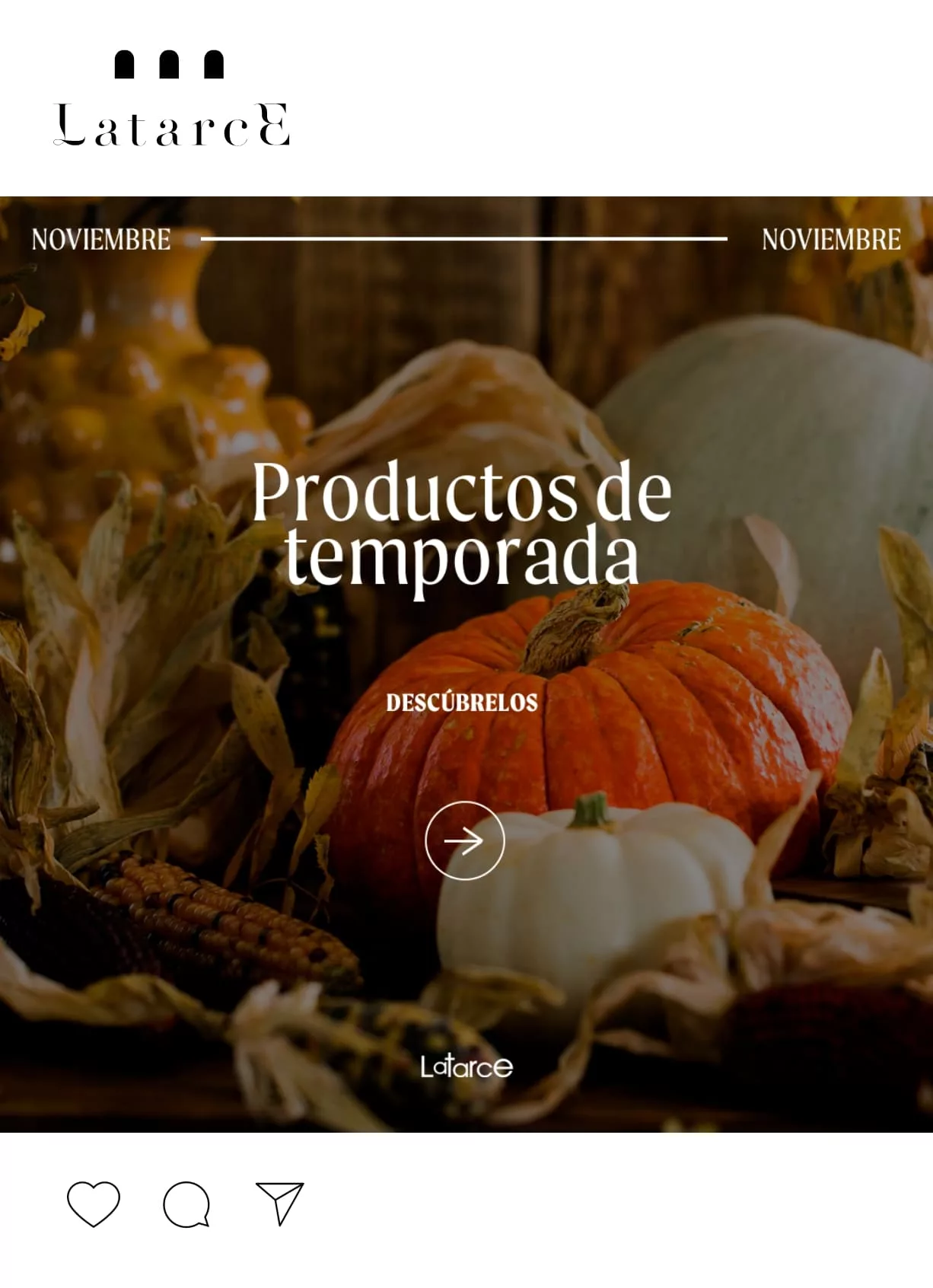
Design for social media
Graphic applications for social networks


