Did you know that global retail e-commerce sales are set to grow to US$6.54 trillion over the next two years? Clearly, e-commerce companies are poised for a big boost. If you have an e-commerce business, it’s time to get down to work.
You may see an increase in traffic to your website, but the real challenge is converting those visitors into customers. That’s why it’s important to design your website with UX in mind. In this post, we will take a look at some of the things you should keep in mind to design an effective e-commerce.
The 5 indispensable tips
When designing your e-commerce, you need to put yourself in your customer’s shoes. Think about the questions and concerns they may have and address them all with your website design. A well-designed website allows customers to find what they are looking for as quickly as possible. In addition to this, they should be able to find all the details and be able to place their order without any problem.
It seems difficult, doesn’t it?
Here are the 5 most relevant tips.
Create a responsive website
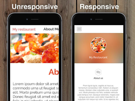
Customers can be visiting your website from any mobile device: phones, tablets, computers… Regardless of the device they are on, your e-commerce must provide a uniform experience. That’s where responsive design comes in. Responsive websites automatically adjust the design and content of your website to adapt to different screen sizes.
In short, they are designed to be flexible.
If your website is not responsive, users on certain devices may not be able to read the content properly or view the full images, resulting in frustration and a high bounce rate.

Reduces loading speed
Have you ever experienced frustration or anger because a website takes too long to load? Come on, we’ve all been through it at least once.
It is not only annoying, but also a huge waste of time. In fact, a long page load speed can drive away impatient shoppers. According to one study, pages that took around 1.5 seconds to load had a bounce rate of 38.24%. On the other hand, the bounce rate was 44.28% for pages that took more than 3 seconds to load.
The solution is quite clear: don’t keep your e-commerce visitors waiting.
But what can you do to reduce the loading speed of your page?
First, find out how your site is currently doing with respect to page load speed. You can go to Google PageSpeed Insights and enter your URL, with which you will be able to check the loading speed of mobile and desktop devices. In addition, they also provide suggestions on how to improve the speed of your e-commerce.
Simplifies the payment process
After a potential customer decides to make a purchase, how much effort does he or she have to make before being able to complete the payment process? Do they have to go through several pages and provide a long list of details?
If the answer is yes, it is a long and unnecessary process that will scare your customers away. Some prospects may simply leave the process halfway through because they are exhausted or distracted.
To avoid this, make the payment process as simple and convenient as possible. Ask potential customers to enter only the information you absolutely need, such as name, address and payment details. This is sufficient.
Provides multiple payment options
Credit and debit cards are definitely popular online payment methods. But don’t assume that everyone who wants to buy from you will want or be able to use them. What if they want to pay cash only after delivery of the product? What if they prefer to use PayPal?
You must take into account different preferences and provide multiple payment options. If someone is specifically looking for cash on delivery and you don’t offer it, they might abandon their cart. To avoid this, offer multiple payment options in your e-commerce such as cash on delivery, electronic payments, mobile wallets, gift cards and cryptocurrencies.
Addresses frequently asked questions
When shopping in your e-commerce, users are likely to have some concerns. They may be related to refund policy, return policy or something else. Make it easy for your customers to find answers to their questions without having to call or email you. Even before they want to contact you, give them the answers. To do this, you must understand their motivation and concerns. An effective and very positive approach to UX is to include a FAQ section that addresses common concerns.
What they say is true: the customer is always right.
And while designing your e-commerce, you should think about the features they will like. Your ultimate goal should be to provide them with a seamless shopping experience, so use these tips to create your online website. If you want to leave this task in good hands, contact us.


