Gallina de Piel Wines
Complete development for the Gallina de Piel Wines project, including the creation of the brand, graphic applications, packaging, illustrations and website.
Brand strategy
Logo creation
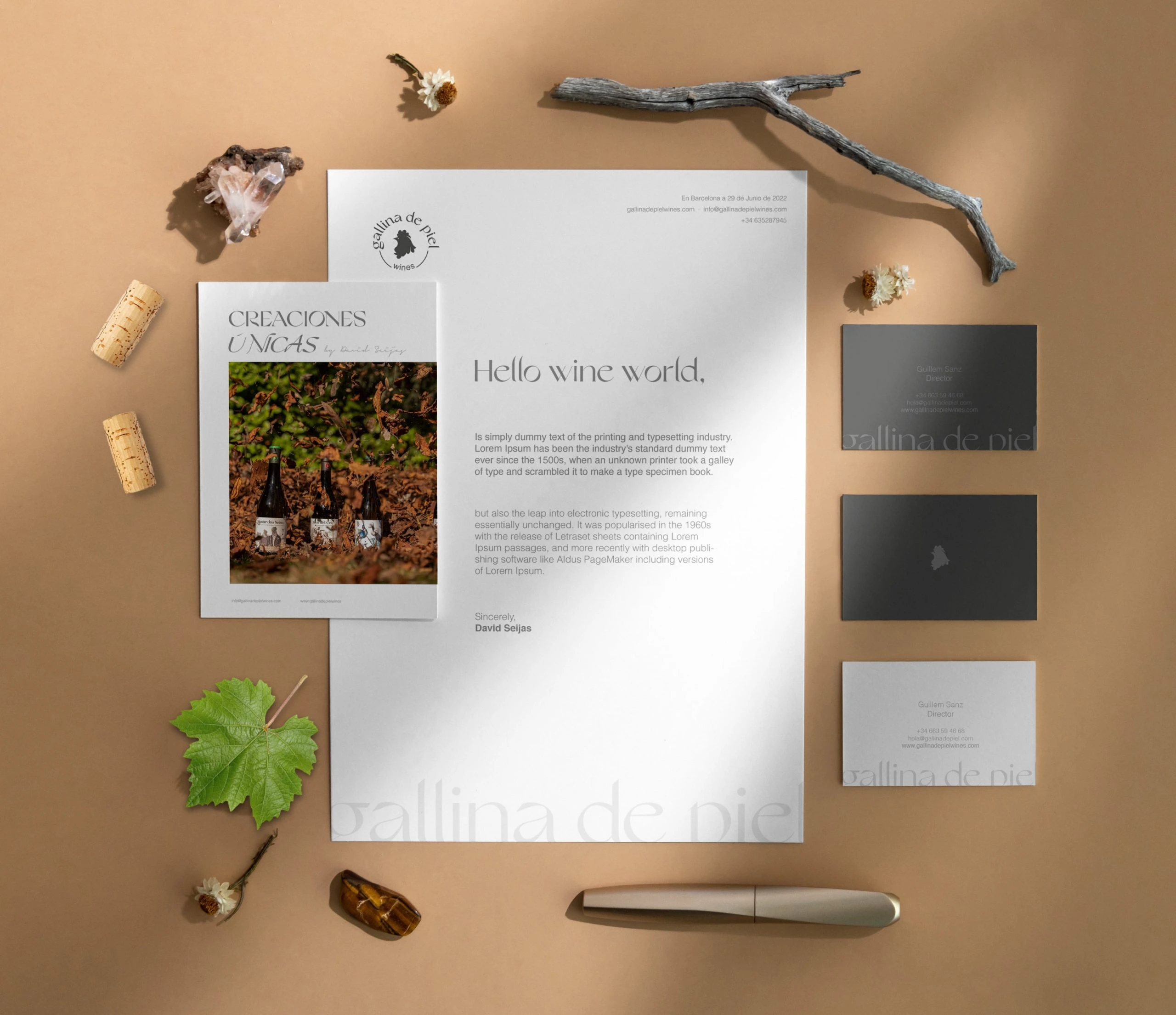
Graphic applications
Wine label design
Branding for Gallina de Piel Wines
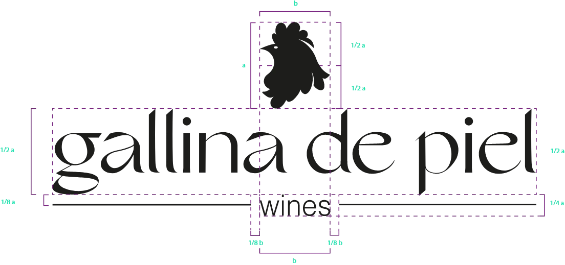
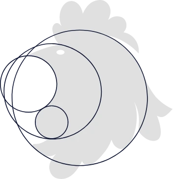
With the initial concept of creating a brand for a non-winery winery, directed by former El Bulli sommelier David Seijas, together with his partner Guillem Sanz, a logo is created that will represent in an iconic, simple and clear way the name given to the brand. A brand that had to reflect the fun, modern, punk and different side of this new concept of a winery full of passion and unique creations.
- Quotation
- Horizontal

#E2E2E2
R: 226
G: 226
B: 226
#FBF7F2
R: 251
G: 247
B: 242
#4C4C4C
R: 76
G: 76
B: 76
#1D1D1B
R: 29
G: 29
B: 27
Grand slang B-Side
Grand slang Italic
HELVETICA and GRAND SLANG
Grand Slang has been selected as the main typeface for the development of this project, being treated and modified to adapt perfectly to the logo, but as a secondary typeface, we saw Helvetica as the best candidate to complement the striking and modern serif typeface. Helvetica is a Swiss sans-serif font designed in 1957 by Max Miedinger and Eduard Hoffmann. Its simplicity, legibility and versatility make it one of the most popular fonts in graphic design.
Bold
ABCDEFGHIJKLMN
OPQRSTUVWXYZ
1234567890 1234567890
abcdefghijklmnopqr
stuvwxyz
Regular
ABCDEFGHIJKLMNO
PQRSTUVWXYZ
1234567890 1234567890
abcdefghijklmnopqrstu
vwxyz
Grand slang B-Side
B-SIDE
ABCDEFGHIJKLMN
OPQRSTUVWXYZ
1234567890 1234567890
abcdefghijklmnopqr
stuvwxyz
Wine label design
Personalized illustrations
Label design for some wines
For this first line of red and white wines, we developed personalized illustrations that captured all the feelings, creativity and history that were part of David Seijas’ life. In these designs we can go through images that lead the viewer to a family atmosphere, with Galician roots in his Manar dos Seixas or to a journey through routes that lead to the Bulli with his Roca del Crit. These bottles, which have won several awards, stand out for their quality and care throughout the creation process.
UX Analysis
Web design
Development and layout
Web design for a wine cellar
We custom designed a website that would represent all the aesthetic values of the brand and that would encompass the history and details of this project full of passion and creativity that was born from two wine lovers. There we present all their creations, the concept of the winery, their mission, vision, values and the differentiation that makes them stand out.
Digital strategy
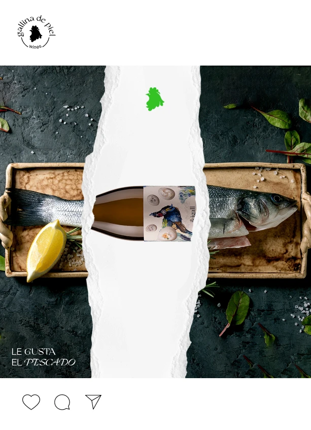
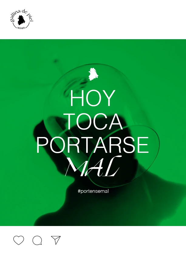
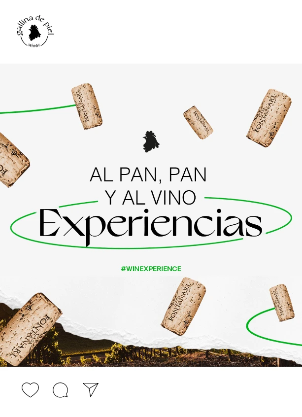
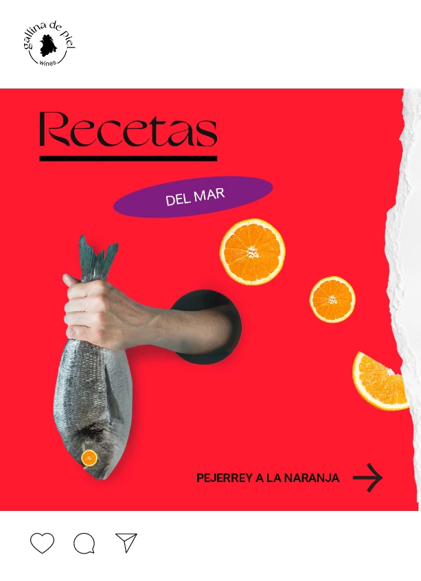
Design for social media
Graphic applications for social networks
Social networks are essential for a brand that targets the final public, especially when it has such an important graphic and aesthetic component. That is why Several has developed a whole line of applications so that the client can have specific bases and in this way, the social media team can show in the best way the feeling of the brand.
